DukeMobile
Led the redesign of the Duke's campus app to enable persona-based feature customization
iOS/ Android Accessibility User Research
Overview
From September to November 2023, I worked on a major redesign project for DukeMobile, an app used by students, faculty, staff, and visitors of Duke University.
As the sole UX/UI designer on the team, I led the end-to-end redesign of the app. I also collaborated with our team's user researcher to conduct and analyze user interviews of mid and high-fidelity wireframes.
Problem
Students, faculty, and staff struggle to find services that are relevant to them, leading to a high drop-off rate. Additionally, 100% of users interviewed were dissatisfied with the overall app layout.
Objective
How might we increase feature discoverability and allow for persona-based feature customization?
Outcome
2.5x increase in user retention post-redesign (when measuring user retention 7 days after downloading the app)
97% of users satisfied with redesigned app during user testing
Pre-redesign

Pain Points
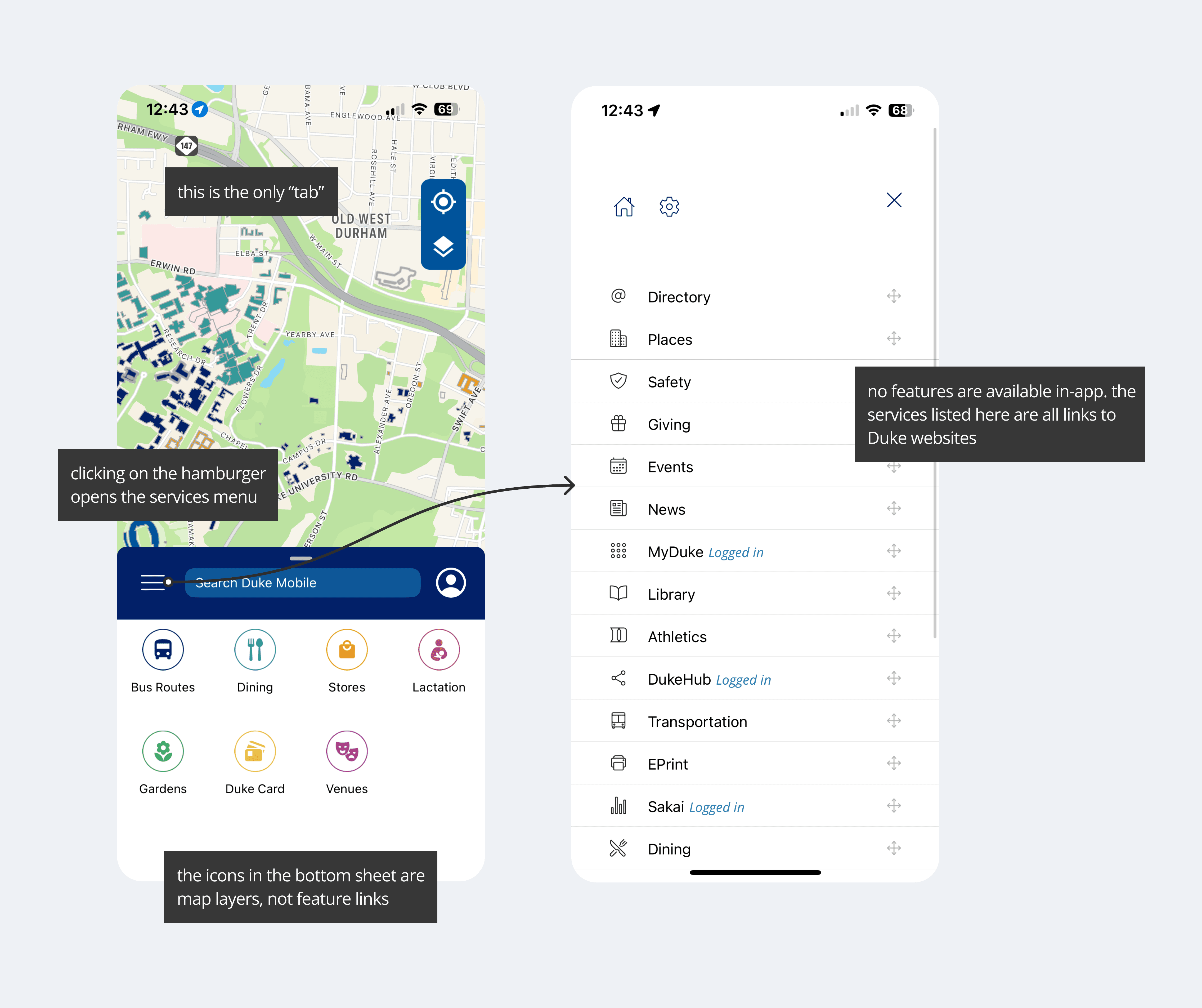
According to user research conducted before I joined the team, students did not find DukeMobile useful or useable.
🚫 No Customization
Users didn’t want to see services that weren’t relevant to their affiliation to Duke (for example, staff having “scholars@Duke” in their list of services)
🤨 Confusing Layout
Most users expected clicking on “dining” in the bottom sheet to bring to bring up a list of dining options, but instead, it displayed a dining layer within the map
🔎 Features hard to find
Users had to dig hard to find service links, which led to them Googling services instead of using DukeMobile
🚮 Not Useful
The only in-app feature was the interactive map, which students no longer needed after a few weeks of starting their freshman year
Project Goals
How might we create a more useful and user-friendly interface for DukeMobile so that users have a reason to come back to the app even after freshman year?
1️⃣ Better information architecture
Create a customizable home tab and separate the map and services into 2 different tabs
2️⃣ Add in-app features
Bring at least 1 key feature into the app that currently exists as an external link
3️⃣ More customization
Allow users to select their affiliation and show them features relevant to them
Final Designs
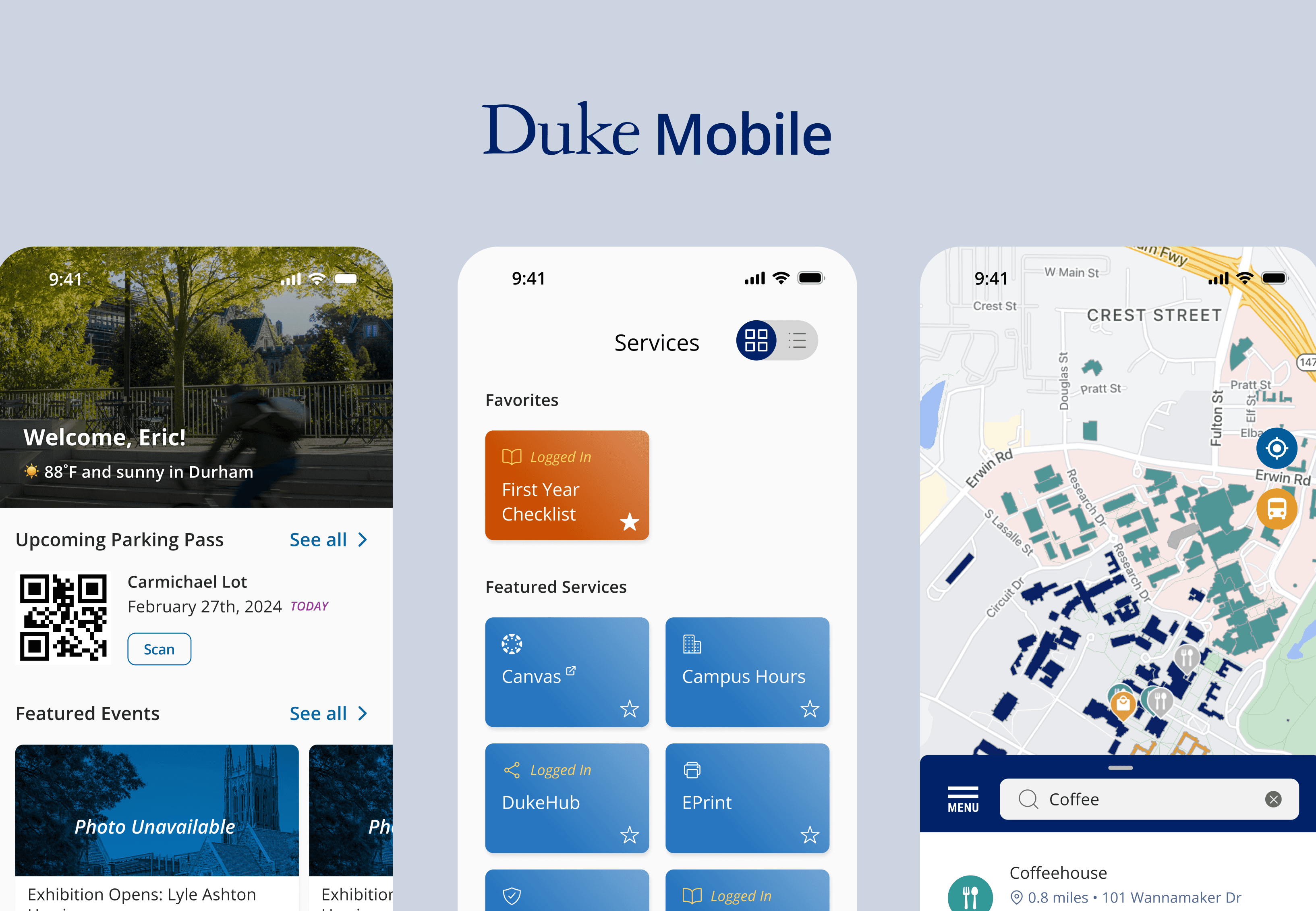
Below are the most recent designs (August 2024) of DukeMobile.
HOME TAB
Increased customization
users can reorganize the sections on their home tab and hide any feature they don’t want to see
Reorganized IA
the design went from 1 tab to 5 tabs, making it easier for users to find what they’re looking for
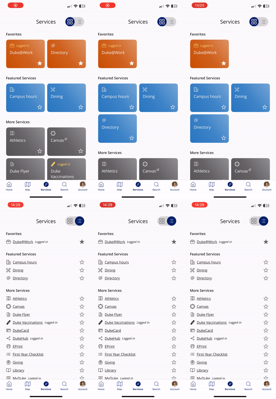
SERVICES
Increased customization Persona-based feature prioritization
users are shown featured services based on their affiliation (selected during onboarding and editable within the account tab)
EVENTS
Additional in-app features
users can now browse/ search for events and add to calendar, an in-app feature some users requested during user testing.
Measuring Success
User retention increased from 6.1% (August 2023) to 15.3% (August 2024) post-redesign when measuring user retention 7 days after downloading the app. A major issue we faced was users deleting the app shortly after being advised to download it as freshman, so this is a major improvement!
Additionally, our team's UXR and I conducted brief 3 minute check-ins with 75 students who downloaded the new DukeMobile app. 73/75 reported a positive experience with the redesigned interface. Students loved the small touches such as the weather and hero image on the home page. They also found having events and news on the home page was much more convenient than checking even/ news-related emails.


